Introduction
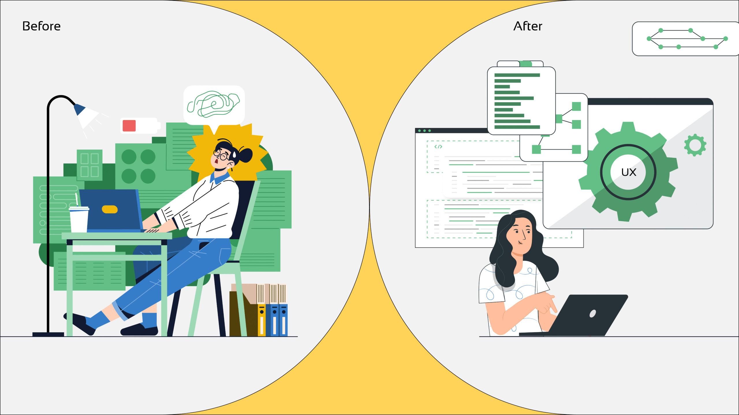
App design is more than just aesthetics; it also encompasses experience, clarity, and functionality. One of the clearest signs that your product needs a UI/UX makeover is when customers complain, “It’s hard to use,” on a regular basis. Despite its simplicity, this term highlights more serious usability problems that have an immediate impact on user retention and satisfaction.
This case study investigates how Lentera Technologies addressed this issue for a highly effective product that was frequently criticized for having an intricate and onerous user interface.
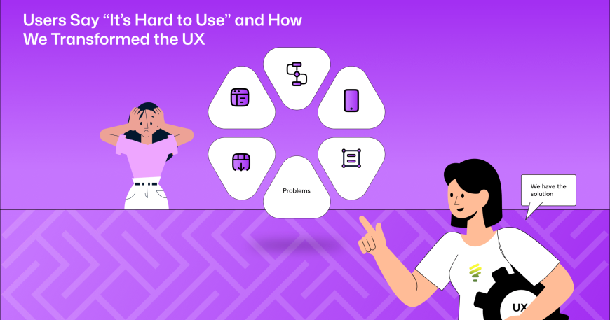
The Problem: Users Say “It’s Hard to Use”
-
- Despite having a lot of features, the app was seeing high drop-off rates and a rise in support inquiries.
- The phrase “I don’t know where to start” frequently appeared in user surveys and in-app comments.
- There are too many options, and none of them are properly labeled.
- On mobile devices, the layout is illogical.
- To figure out how to do even basic things, I have to call someone.
- These issues were not with the software’s capabilities but rather with how it made people feel when they were trying to use it.
Key Challenges Identified
1.Overwhelming user interface: Each panel displays an excessive amount of activities that lack a hierarchy.2. Uncertain Navigation: Users had to move through multiple layers to do fundamental functions.
3. Absence of Onboarding: Since they received no instructions, new users were irritated.
4. Unreliable Design Elements: Icons, buttons, and colors varied from one page to the next.
5. Inadequate Mobile Optimization: The smartphone UI was cluttered, making it difficult to tap and scroll.
Our Approach: Discovery and Audit
- We looked at statistics to find out where users were dropping off after performing a comprehensive UX assessment.
- User journey maps were made for the top five most used functionalities. analyzed the comments from the survey and support logs.
- This clearly showed where improvements were needed.
Key Tools Used
In order to speed up iterations and gather input from stakeholders, we used Figma for interactive prototyping and user interface design during the redesign process. For post-launch monitoring, we employed Firebase and Google Analytics to track user behavior, measure engagement, and evaluate device performance. These technologies ensured that the design was user-friendly and supported by data.
Implementation Process
Phase 1: Analysis and Planning- Important user flows and areas of conflict were found.
- To validate our findings, we conducted user interviews.
- To create user profiles and journey maps.
Phase 2: UX Redesign - Simplified workflows that reduce the number of steps.
- Wireframes were made with a clear grouping and structure.
- Task-based navigation has taken the place of feature-based menus.

- Developed a uniform, unambiguous design system.
- Improved spacing, icon clarity, and typography.
- Layouts were designed with mobile devices in mind.
Phase 4: Onboarding & Help Features - Tooltips for a detailed onboarding procedure have been included.
- The software incorporates contextual cues.
- It provided immediate guidance for difficult tasks.
Phase 5: Testing & Deployment - It collected user feedback to enhance interactions and carried out A/B and usability testing.
- Design changes were implemented gradually to encourage adoption.
Results
The results of the redesign were instantly noticeable and measurable: - 3.2 minutes was reduced to 1.4 minutes for the task.
- More than 35% fewer support requests were made, particularly for onboarding and navigation.
- The onboarding completion rate increased from 39% to 88%.
- User satisfaction scores went from 6.4 to 9.1 out of 10.
- The App Store rating increased from 3.4 to 4.5 stars in just two months.
- Without any outside help, users reported feeling more knowledgeable, in control, and confident when using the app.
Conclusion: When “Hard to Use” Is the First Sign
When users say that your app is “hard to use,” it’s not a minor annoyance; rather, it’s an indication of friction between your users and your product. Ignoring that friction hinders growth, turns off new users, and increases the workload for your support personnel.
The good news? You don’t have to start anew. A user-first design approach and the right mindset can transform confusion into clarity.
Let’s Make Your App Effortless to Use
Does your app show any signs of user experience fatigue? To correct it, let’s cooperate. Get a UI/UX consultation tailored to your product by getting in touch with info@lentera.in.


